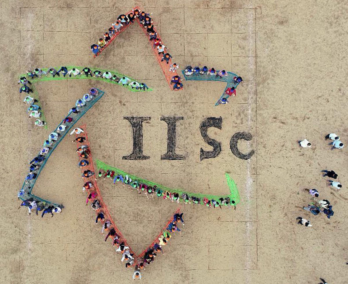
When the Indian Institute of Science introduced a brand new logo last week, several professors and alumni stayed away from the launch, complaining the design was tacky.
Soon after, a group of old students of the 110-year-old institute came up with an offer: they would design a better logo, free of cost.
Mumbai-based company VGS, which created the Aditya Birla graphic, was paid a neat fortune for the logo, an IISc source says.
He puts the fee at between Rs 2 crore and Rs 3.5 crore. Metrolife was not able to get through to Director Anurag Kumar and CPDM director Amaresh Chakrabarti for confirmation.
The new official logo is a minimalistic picture of an atom in three colours, with “IISc” written across it in an old-fashioned serif font. The old logo, by contrast, was hand-drawn with a candle and a laurel around it.
The institute has also introduced a modern, computerised image of the old logo. It is called the “crest”. While the crest will appear on degree certificates, the logo will be used to promote the IISc brand.
INTERNAL BRAINSTORM
After the logo was released, discussion was rife on a WhatsApp group of the IISs’s design school, The Centre for Product Manufacturing and Design, or CPDM. A group of 257 design experts debated whether the new logo represented the legacy of the great institution.
One of them, alumnus Nitin Gupta, had an idea: what if the alumni brought out its own logo? Logo-designing is not new to CPDM. Every year, they hold a festival called ‘Ripples’, where students compete to produce logos for the festival. Some entries, in Nitin’s opinion, match international standards.
He messaged nine like-minded alumni, and they started their own group on Telegram. They are ideating on what an improved design could look like.
VIRAL EFFECT
And since the news went viral, more people have asked to be part of the group, but the members have kept the group limited to the original nine.
The nine, after much discussion, have produced a document with an erudite deconstruction of the new official logo, and argued the case for a re-do.
This document suggests it is not personal prejudice driving the project, but the informed opinion of trained, expert designers.
DH had earlier reported IISc Director as saying he would look at an alumni-designed logo if it was brought to him.
SEVEN ANONYMOUS
Of the nine members, only two are in public view. The other seven are anonymous, fearing official retribution.
Nitin and Vinay Reddy, who run their own start-ups, are the face of the group. The document says “designers with expertise in graphic design and branding should evaluate any new logo or branding proposal. Such things should not be left to a committee decision or a democratic selection”.
Nitin says the ideal outcome is for IISC to go back to VGS and get the logo redone. The alumni should be allowed to participate in some capacity. If VGS does not agree to redesign its work, the nine-member team will propose a couple of logos from their side, he told Metrolife. The document, however, is more curt. “Honestly, IISc should ask for its money back,” it reads.
Legacy
IISc is the country’s top research institution. It was established in 1909 with support from Jamsetji Tata and Krishna Raja Wadiyar IV. Nobel laureate C V Raman used to be the institution’s director from 1933-1937. It has been ranked the top university in India from 2016 to 2018 in the government’s NIRF ranking. It’s incumbent director is the eminent engineer Anurag Kumar.
Existing identity
The document also questions the need for such a drastic change in the identity of the institution. It is like changing the IISc tower, which is universally recognised as standing for the institution.
Too pedestrian
The iconography of the three ellipses, used to indicate an atom, is too simple. A simple Google search of words like ‘atom’, ‘science’, ‘chemistry’ and ‘physics’ brings up images that look like the new logo. Solution: People should not be reminded of millions of similar images of the atom.
Inconsistent
The logo has too many inconsistencies. For example, the difference between the sharp and round corners on the ellipses. Even if this were to mean something philosophically, it doesn’t serve any purpose as the logo is going to be used on all sorts of platforms and in all sizes. These differences are too subtle to be noticed in a small size.
Typography
The designer has kerned (decreased) the space between the two I’s. The use of serif font is not complementing or contrasting the graphic. The C is out of bounds of the graphic element.
Key visual objects
The document gives examples of famous brands, where key visual objects are never changed even when a logo is refreshed. Brands like Shell, Starbucks and Windows have frequently changed their logos, but the essence remains the same.
Flawed semantics
The broken and hidden lines seem to convey the idea of weakness, instability, lack of cohesion, lack of communication between different parts of the same entity.
Negative space
A logo should be identifiable by its negative space, or the space around and between the subjects of a picture. The negative spaces are now made up of inconsistent graphic forms. The document even throws a challenge. It shows the negative space of part of the Volkswagen logo and asks if it is recognisable, which it easily is.
Associations
People usually associate a design with something they have seen before. For instance, in smaller print, the logo looks like a star. It may even be perceived as the Star of David, a Jewish symbol. Other things it is likely to be associated with are the detergent brand Ariel and the ‘90s TV show Shakthimaan.
Colour mismatch
Graphic designers use colours that look harmonious on the basis of established rules. This logo does not follow them.