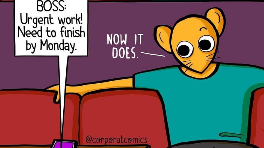

Webcomics have become a growing trend in recent years thanks to social media. They capture short relatable tidbits in a few panels, and designing them involves many challenges. From being original to being consistent, artists have a lot on their plate.
Adapting to the platform
The minimal art style of webcomics is “a function of the medium”, says corporate professional Shubham Khurana, who uploads comics on social media. He observes that on Instagram, “the more elaborate the illustrations, the less people are able to relate to the comics”. He cites the reduced attention span on social media as the reason for this. “Everyone has an attention span of less than a goldfish nowadays,” he rues.
Referencing the digital age, Mukund Sharma, assistant editor at Bakarmax comics, says that many artists post on social media now. “It forces you to play by the rules of the algorithm,” he says, adding that this leads to “many restrictions regarding image count and content.” To get around this, Bakarmax uploads comics on their own website.
This allows more freedom with the length and layout of the comics. “We also use a vertical scroll format to complement reading on a screen,” he adds.
Drawing inspiration
For these artists, ideas primarily stem from their experiences. Take, for example, Shubham’s Instagram-based webcomic, ‘Corporat Comics’, where he captures the “peculiarities and idiosyncrasies of corporate life” and presents it humorously. Whenever he observes something interesting at work, he makes a note of it, so he has a multitude of cues to work on over the weekend.
Similarly, Instagram illustrator Christina Furtado who posts as @_potatoface__, draws inspiration from the people she has met and places she has been to. She renders her childhood “memories into comics or animations that evoke nostalgia”.
Even Arun Sharma, who uploads comics on his Instagram handle @thegandabaccha, takes inspiration from his life in north India; the things he has seen and heard. He uses his comics as a means to comment on social issues. “Society often hides serious matters from children, reprimanding them for questioning them,” he says. Through his character ‘the ganda baccha’, he aims to provide “the unadulterated truth” to readers.
Speaking about humour, Mukund explains that one’s unique interpretation of mundane events is what gives birth to it. He believes that to come up with good jokes “you have to be silly”. On character design, Mukund says the character’s personality should reflect in the designs. “If your character gets into a lot of fights, it makes sense for him to have a scar or two,” he explains.
Design process
The extent of planning needed in creating webcomics is a personal preference, say artists. Shubham, for instance, doesn’t force himself to work within constraints of a storyboard. Over time, he has noted that the more extensive a storyboard, the more frames are required to portray the story. “This makes it less likely that people will read the comic to the end,” he says.
On the other hand, Bakarmax follows a methodical process during production. Mukund informs that they first decide on a story for the comic, based on which they take a call on the number of panels required. “We first make a storyboard to represent the placement of the characters across panels,” Mukund says. “These are later inked on software,” he details.
Arun’s panelling is inspired by his ardour for poetry. “Poems often convey themes in stanzas of 4 or 6 lines,” he states. Preferring a similar rhythm for his comics, Arun draws them in 4- or 6- panelled pages.
Christina feels that storyboarding is essential to making comics. “Unlike animation, you have limited slots to tell a story. You need to ensure that the frames you depict are perfect,” she advises. She also deems it helpful when collaborating so the other party gets a step-by-step assurance of the end product.
Style
Mukund says each artist has an individual style. “One needs to have a reference point for the visual image,” he elaborates. For this purpose, the concept art of the characters is prepared during pre-production. This is later referred to while inking the comic. Stressing the importance of the typeface, Mukund says, “it elevates the design and helps the comic catch the eye of the viewer.”
Some others like Arun convey their stories in a silent form, “using only illustrations to progress the story”. “Language should not be a barrier,” he says when asked about the style. He prioritises simplicity in his colours, “using a minimal and flat palette so readers can grasp it in a second”. Arun sometimes intentionally makes his comics crude. “My intent isn’t to flaunt my illustrations but to send a message,” he says.
Christina describes her style as “cartoony,” characterised by big eyes and the lack of a nose. To capture the expressions of her characters, she uses pictures of herself making funny faces as a reference. She utilises a warm palette in her works that give them a nostalgic warmth often associated with memories. However, this depends on the emotion you want to express. “You wouldn’t use warm colours when showing a sad monsoon scene,” says Christina.
Emphasising on the importance of lighting and shadow, she says they “bring life” to comics and add a touch of realism.
Shubham believes that a consistent style only solidifies over time. “One doesn’t have to force oneself to make the comics a certain way,” he advises, adding, “your visual language expresses itself as you continue to draw more comics.” Wanting to retain the handwritten quality of the text, Shubham also created his own typeface with his handwriting. This allows him to keep the font consistent across issues. He also holds the consistency of the theme in high regard.
“Having fixed themes and remaining consistent with the schedule makes people come back for the comics,” he explains.